Tuesday, 6 June 2017

Photographic Tales

This is a series of four micro books, titled 'lane', 'river', 'field' and 'path'. 
The idea came from a creative writing exercise, where I described, using only ten words, a photograph of my choice. From the ten words, I then chose five which I included in a short narrative, themed around the photo.
I thought it was a good idea to select images from my existing stocks of photographs, rather than deliberately setting out to take specific shots. I wanted to avoid looking for an image and a narrative at the same time, thus allowing a less conscious flow to the creative writing.
Initially, I was going to include the image alongside the text, but felt the viewer would be too influenced by the photo. It was important to let the text describe a scene in the viewers mind.
I used tracing paper for the cover and newsprint for the text page. Fabriano paper was stretched, drawn on with ink pen and then splattered with ink to create the individual hand painted cover themes.
Each title has been inkjet printed in a multiple of six, with each book measuring 105 x 50mm.
 

Photographic Tales: 'lane', 'river', 'field' and 'path'. 2017
105 x 50mm


Inside: 'field'.

Monday, 17 April 2017

Leat

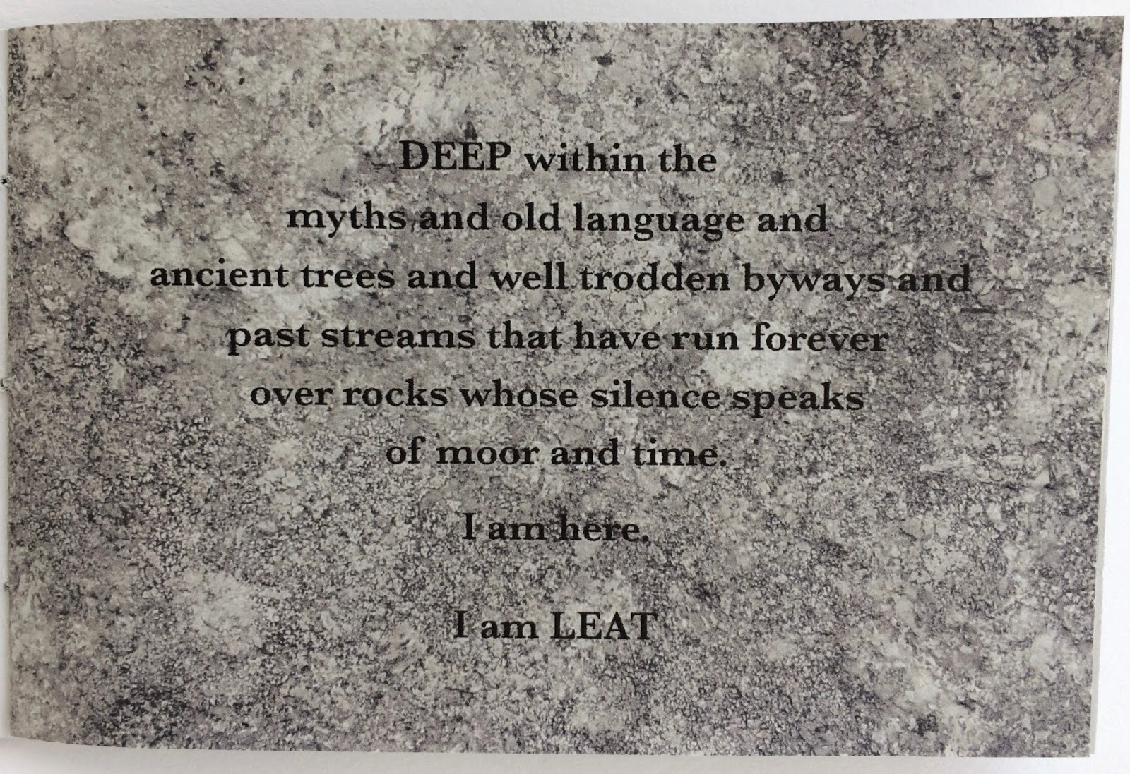
Leat is an edition of eight small hand-made 8 page books that use images from 'Drawing (from) the Leat' to give a sense of how the leat inspires me.

I have worked on drawings and mark making techniques using charcoal, graphite and ink to evoke a suggestion of the presence and power of the leat on Dartmoor.

Leat also includes text that comes from the inspiring visits I made to the leat for my research.


Cover: Leat 2017
134 x 88mm


Inside: Leat 2017


Inside: Leat 2017
Ink on paper

Drawing (from) the Leat

Drawing (from) the Leat is a one off sketchbook of experimental drawing and mark making using charcoal, graphite and ink on paper.

It's theme is based around the Devonport Leat on Dartmoor. The leat is a man-made channel that took water from sources high on the moor to supply water to residents in Devonport. Now the city of Plymouth is supplied by Burrator Reservoir, so the leat feeds into the reservoir.

It is an incredible feat of engineering, with tunnels and aqueducts that follow the contours of the moors. To me, the leat feels like a natural watercourse, although it holds a power and presence on the moor in the same way as the rivers and tors.


Front cover: Drawing (from) the Leat 2017
213 x 183mm


Inside page: Drawing (from) the Leat 2017
Graphite on paper


Inside page: Drawing (from) the Leat 2017
Graphite and ink on paper


Inside page: Drawing (from) the Leat 2017
Ink on paper

Wednesday, 30 November 2016

Counter Plymouth Artist Book Fair

The third annual Counter Plymouth Artist Book Fair was held in the Davy Building at Plymouth University at the end of October.

It was another great day, with more contributors and a good selection of presentations/talks by contributing artists.

As always, it was a great opportunity to meet and talk to fellow book makers and be inspired by their creativity. I sold a few books and came away buzzing with ideas!

Looking forward to next years event! 

http://www.counterplymouth.com


Counter Plymouth 2016

Friday, 23 September 2016

Extraction/Response

Extraction/Response is a hand made book of poems, created by extracting text from the Plymouth Herald newspaper. The poems are my personal response to living in Plymouth and were devised back in 2012.

The response is about the mixed relationship that I've had with Plymouth - a city I wasn't born in, but have lived in for over 35 years. It was never my intention to stay beyond the first four years, but life had other ideas!

When I originally had the idea to make the book, I produced only one large format book, but recently felt that it was time to refresh the design and, more importantly, to make multiples.

The design for the cover came from material made during an afternoon of experimental painting/mark making. I had archived the various pieces of work, which can always be a useful place to revisit when looking for book covers or ideas!

Printing using a home inkjet printer can have its drawbacks; the main one being the restriction on paper weight that the printer will tolerate. I find this is usually around 170 - 200gsm. Using a heavier weight can result in the paper jamming or sticking as it is pulled through the printer. The sticking is a particular problem if the images need to fit evenly across the page. For this project it wasn't a problem because I placed one image in the centre of the page and cut it out afterwards, and therefore was able to use 220g cartridge paper.

The Japanese stab binding worked well on this book and enables the viewer to flick the pages easily. It's a very simple method of binding and various types of thread can be used, making a secure and neat finish.


Front Cover: 'Extraction/Response' 2016
210 x 99mm Ink on 220g smooth cartridge paper


Inside: 'Extraction/Response' 2016
210 x 99 mm Ink on newsprint paper


Extraction/Response

Extraction/Response is a hand made book of poems, created by extracting text from the Plymouth Herald newspaper. The poems are my personal response to living in Plymouth and were devised back in 2012.

The response is about the mixed relationship that I've had with Plymouth - a city I wasn't born in, but have lived in for over 35 years. It was never my intention to stay beyond the first four years, but life had other ideas!

When I originally had the idea to make the book, I produced only one large format book, but recently felt that it was time to refresh the design and, more importantly, to make multiples.

The design for the cover came from material made during an afternoon of experimental painting/mark making. I had archived the various pieces of work, which can always be a useful place to revisit when looking for book covers or ideas!

Printing using a home inkjet printer can have its drawbacks; the main one being the restriction on paper weight that the printer will tolerate. I find this is usually around 170 - 200gsm. Using a heavier weight can result in the paper jamming or sticking as it is pulled through the printer. The sticking is a particular problem if the images need to fit evenly across the page. For this project it wasn't a problem because I placed one image in the centre of the page and cut it out afterwards, and therefore was able to use 220g cartridge paper.

The Japanese stab binding worked well on this book and enables the viewer to flick the pages easily. It's a very simple method of binding and various types of thread can be used, making a secure and neat finish.


Front Cover: 'Extraction/Response' 2016
210 x 99mm Ink on 220g smooth cartridge paper


Inside: 'Extraction/Response' 2016
210 x 99 mm Ink on newsprint paper


Thursday, 18 August 2016

Tsunami

A book using extracted text from a newspaper article about the Japanese tsunami of 2011.

The article is about a man, Yasuo, who is still searching for his missing wife, Yuko. He recalls their last morning together, travelling to work and making plans for the evening, then the painful last text messages they shared. 

Yasuo survived, but Yuko was never found.

A couple of years later, while watching the Japanese coastguard, Yasuo decided to learn to dive, to search for Yuko and finally bring her home. His love is demonstrated so hugely by his repeated and probably futile searching.

The extracted text doesn't differ in theme from the article, but separates out the romantic and poetic from facts and journalism.

I decided to add some colour images, which I made using pastels, charcoal and graphite worked over inkjet printed text. I took photos of the images and was a little concerned when the colours changed from the original; the black/grey charcoal turning to green. However, when I scanned the images, they thankfully remained true to colour. I was then able to upload them to the final document. I particularly like the grainy texture and the depth of the text in the images.


'Tsunami' 2016
148 x 148mm
Inject printed on 135gsm Colorplan cool blue and 100gsm white drawing paper


Inside: 'Tsunami' 2016
Images: Pastel, charcoal and graphite on inkjet print